
Beginning
AI, AI, AI… It’s buzzing everywhere right now.
As a UX designer, I’ve tried more than a few of these tools. Some impressed me; others, not so much.
Today, I want to talk about my recent experience with Stitch by Google, a tool that had me thinking, “Okay…this could actually be something…someday?” I decided to put Stitch to the test on a real design task. What I got was part magic, part meh — and that’s exactly why I’m writing this.
Stitch is not going to replace UX designers anytime soon.
But it’s evolving fast. It’s useful if, and that’s a big if, you know how to guide it.
What Is Stitch Actually Good At?
What Is Stitch Actually Good At?
Let’s start with the good stuff because Stitch does shine in some areas. I handed over a UI I was working on and asked Stitch to improve it. No user flow, no logic — just polish, and the result?
Pretty impressive!!!
Stitch knows how to clean things up. It understands spacing, layout balance, and modern UI aesthetics. It gave my design a nice visual upgrade. Not revolutionary, but enough to make me pause and say, “Okay, this is helpful.”
What Happened When I Used Stitch on a Real Project?
What Happened When I Used Stitch on a Real Project?
To really test Stitch, I gave it two different design challenges. Here’s how it went down:
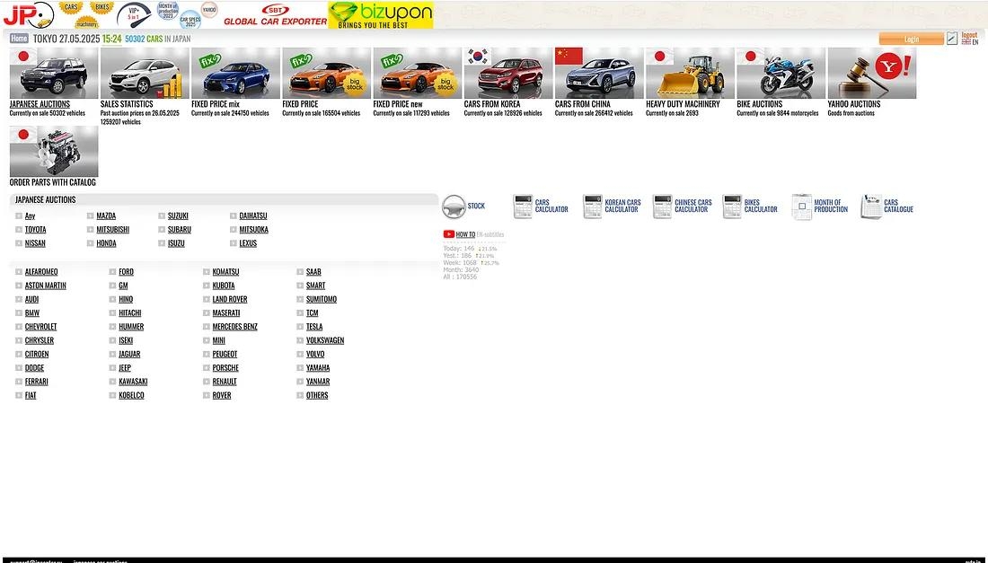
Challenge 1: Car Auction Website Redesign
Prompt: “Redesign this car bidding website to make it feel more modern, trustworthy, and user-friendly.”
I uploaded the existing UI from a real car auction site — cluttered layout, outdated styles, and a bit of a “what-year-is-this?” vibe. The design worked functionally, but it didn’t feel confident, approachable, or intuitive.
Here’s what happened…
The Original UI: A typical listing platform. Lots of vehicles. Lots of filters. But it lacked visual hierarchy, breathing space, and trust indicators.
Stitch’s First Output: It gave me a cleaned-up, card-based design with neater spacing, modern typography, and simplified visual structure. It looked better at first glance.
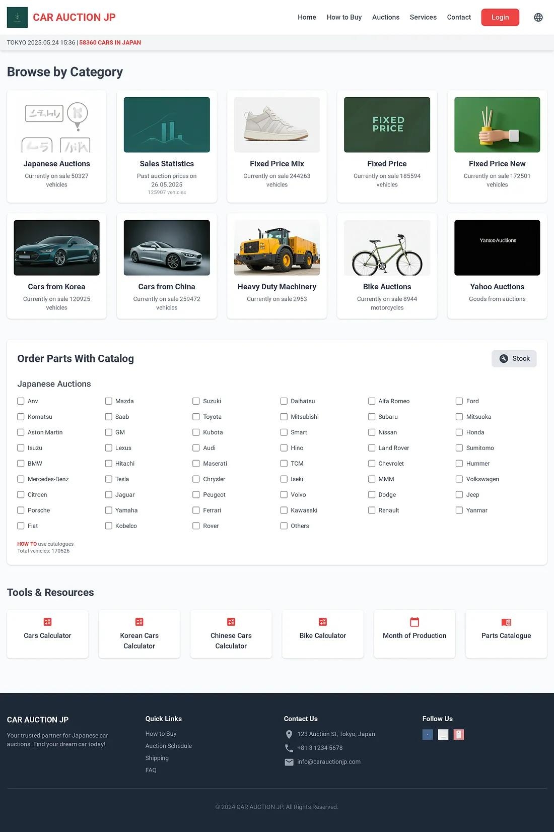
What Worked:
- Better visual hierarchy.
- Simplified component styling.
- Improved spacing and clarity.
What Didn’t:
- UX logic wasn’t touched.
- No focus on task flow or user goals.
- Navigation and filtering still felt like an afterthought.
- Trust-building elements were purely visual, not functional.
Bottom line: It was a visual reskin, not a UX rethink.
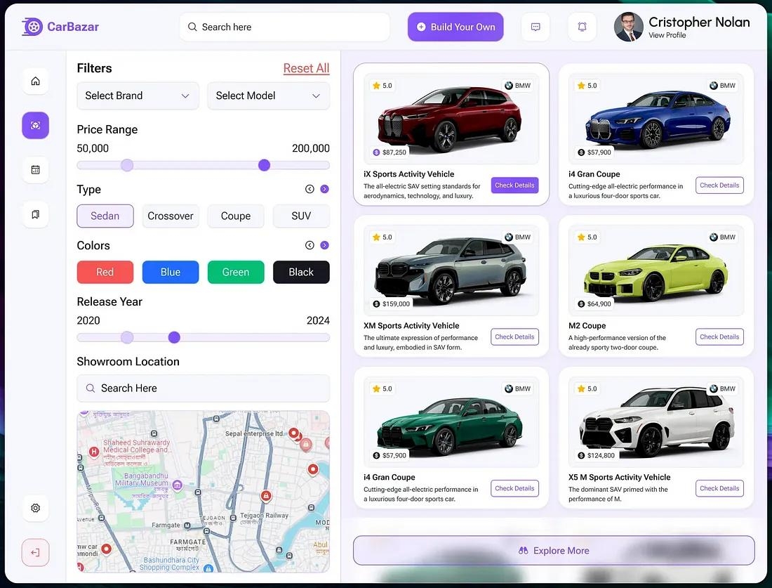
Challenge 2: Enhanced User Experience for a Car Auction Website
Challenge 2: Enhanced User Experience for a Car Auction Website
Prompt: “Redesign this car listing UI to better use space, look modern, and improve user navigation.”
The Original UI: A fairly polished UI, it had clear filters, strong branding, and good visual consistency, but was a bit heavy on screen space for filters, which limited product visibility.
Stitch’s Output: Shifted the visual focus from filters to listings. Increased the number of visible car cards without overwhelming the user. Lightened the UI and redistributed the layout weight more efficiently.
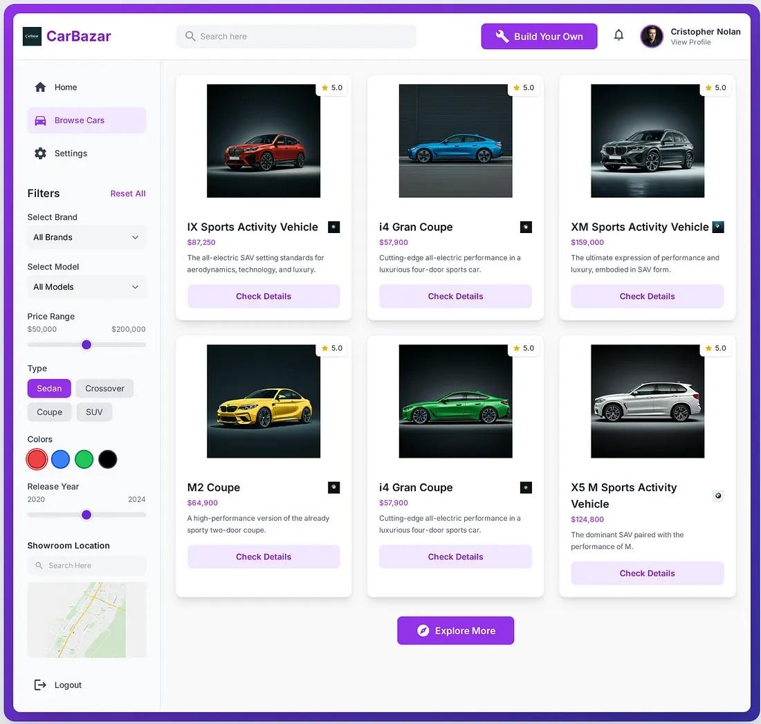
What Worked:
- More car cards are visible above the fold.
- Cleaner, more minimal left panel
- Better balance between function and visual engagement
What Didn’t:
- Didn’t reimagine the experience for different user types
- No contextual logic applied (e.g., prioritising popular filters)
- Still lacked strategic UX improvements like saved preferences, filter hierarchy, or empty state handling.
Challenge 3: SkyU Alerts testing Stitch on a functional DevOps UI
Challenge 3: SkyU Alerts testing Stitch on a functional DevOps UI
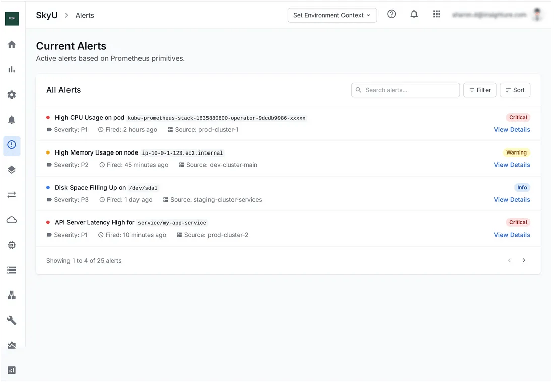
Prompt 1: “SkyU is a DevOps platform that integrates with Prometheus for primitive-based alerts. Using the uploaded design theme, create a UI to display all current alerts.”
This time, I gave Stitch a specific use case of SkyU’s alert system and a real UI from our platform. The goal was to see how well Stitch could work within an existing design system while still creating something functional and clean.
The Original UI: Focused and practical, but very developer-heavy. It’s data-rich but visually dense and could use better layout balance.
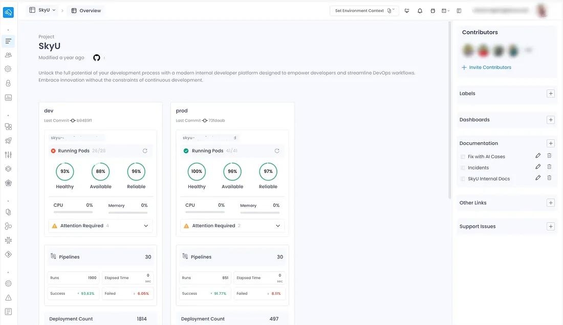
Stitch’s First Output: Surprisingly, this was… not bad. It respected the structure of the original layout and maintained visual consistency with the design theme I provided.
Stitch also seemed to understand how Prometheus-based alerts are typically listed, which was impressive. It grouped the data cleanly, used familiar table structures, and simplified some of the content blocks, making the screen easier to scan and digest without losing key information.
Follow-up Prompt: “Can you also give me a summary view of the alerts?”
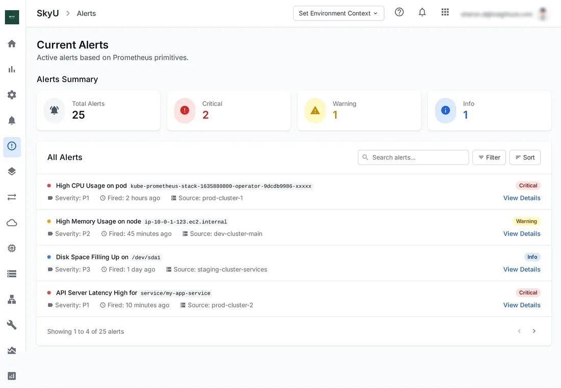
Stitch’s Summary View Output:
It added basic metrics like “Total Alerts,” “Critical,” “Warning,” and “Info,” which helped round out the page. But the layout felt a bit generic, more like surface-level data blocks than a meaningful summary.
It also didn’t fully adhere to the original design system or colour standards, and visually, it lacked polish. It added some value functionally, but aesthetically, it missed the mark.
Can Stitch Handle Real Design Problems?
Can Stitch Handle Real Design Problems?
So I pushed Stitch further with full UX narratives, user goals, and flow logic. What came back? Disconnected screens. Generic layouts. No real understanding of user journeys or behavioural context.
That’s when it hit me:
Stitch knows how to draw a screen. But it doesn’t know why that screen exists.
But what if you just want to enhance the UI? This is Stitch’s sweet spot.
It’s great at:
- Visual cleanup.
- Updating styles.
- Enhancing layout aesthetics.
- Reducing noise and creating clarity.
If you’re looking to modernise a screen quickly, Stitch helps get there faster. But again, you have to guide it.
So… is Stitch worth using?
So… is Stitch worth using?
Hmmm… Yeah… if you already have something built and just need it to look better, Stitch can help.
It’s great for tidying up layouts, refreshing styles, and making things feel more modern. Think of it like a junior designer who’s good with visuals.
But that’s about it!
It’s not going to
- Solve problems, rethink flows, or consider the user.
- It doesn’t know your audience or your goals.
- You still need to do the thinking.
And like all AI, it’s only as good as the prompt you give it. If you don’t guide it, it’s not going to guide you.
My Final Take
My Final Take
Stitch is learning fast, and yeah, it’s cool. But it’s not replacing UX designers any time soon. It’s just a tool. A helpful one, sure. But still just a tool.
Use it, let it save you time, let it clean things up, but don’t expect it to carry the design!
Because at the end of the day, it’s still you who knows the user, the problem, and the purpose.
Stitch can make it pretty, but you make it work…